Workbook
Photo Editing - Bob Robertson
Brightness and Contrast - 01
|
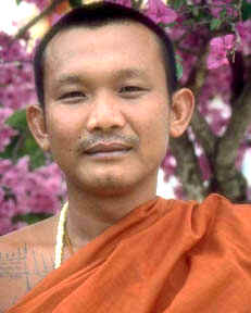
Right-Click on this picture and save it to work
on. |
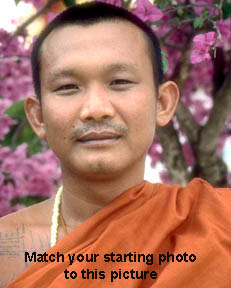
Right-Click on this picture and save it to
compare. |
 |
|
| Hints: Adjust a picture for the most important areas in the picture. In a people picture that usually means the face. The overall colors are dim. They lack both brightness and contrast. Be gentle with the brightness and careful with the contrast. If you are able to adjust density curves (i.e. Photoshop) try using the density curve adjustment. |
The comparison photo: Use your photo editor to match the picture on the left with the photo on the right. Notice how the pink flowers look livelier and the orange robe seems brighter, livelier. This isn't perfect but is certainly a ton better than the starting point. You don't have to be perfect, just close. |
When you have made the edits place this page (With both pictures, your corrected original and the comparison photo) on your IT-222 web site and make a link to this page from your main IT-222 page. Be sure to replace the "Type your name here" with your name.